I’ve said many
times in the past that black is the most difficult color to print.
Some time ago,
I wrote how gloss poly seemed to produce the best black colors:
And later, I
showed how our new whiter matte poly was producing better blacks during one
stop of a Northern California road trip:
What I have not
discussed before, is how artwork and the creation of black in the art changes
the color of the print output.
According to
Tony Molina, the inhouse Graphic Artist for Color Label Solutions, “most
artwork today is created in Adobe Illustrator, InDesign, Quark and other
software. In this software, many people believe
that 100% K (black) is the best way to produce this color. However, 100% K is not really black and can
be somewhat flat.”
According to
Phil Forbes in this article in PackHelp:
"Turning all
these percentages (C,M,Y,K) up to 100% will give you black that's kind
of dull, washed out and not very black at all.”
As an example
of the differences in black color print output, we received recently artwork to
test print. When printed initially, the
black was not very “rich”.
 |
RGB Values Not Zero
|
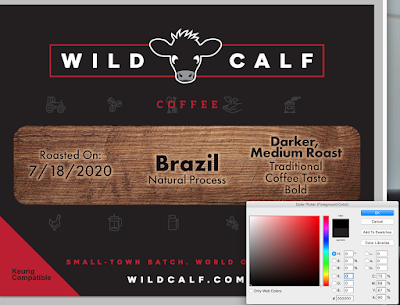
By opening this
file up in Photoshop and using the Color Picker function, Tony found the RGB
values 35, 31, and 32; but the K% was 74:
 |
RGB Not Zero
|
According to
Tony, “using RGB values that create at least a 90% K value will create rich black colors. Make the R, G, B values 0 will create a black color that
meets the 90% K requirement. In the
above referenced article, the author, Phil, has the C,M,Y, settings at 60, 60,
60. You can have any combinations you
want as long as all 4 primary colors are used and the black is 90+.”
Here Tony
changed the colors in the same artwork to get a better black produced.
 |
RGB Values Zero
|
And this color
produced a much richer black.
 |
Richer Black
|
To check this
myself, I opened up BarTender and created a simple black square. Once I selected black, I found that this
software creates this color following Tony’s recommendation: Zero for R, G, B.
 |
RGB Values Zero
|
And when I
printed on our matte poly, the black color print output looked great.
 |
BarTender Color Picker Black
|
The color
picker in BarTender does not offer a C,M,Y,K option.
The bottom
line; how you create black color in artwork makes a big difference in your
print output. One caveat: different
printers and label media also make a difference in print output. For example, we’ve found the black from the Memjet-based
Afinia L801 or L901 printers produce darker, richer black colors generally when
compared to the Epson printers; regardless of the artwork. The dye-based inks in the Afinia printers
produce very nice blacks. Although the
pigment-based inks in the Epson printers can produce great looking black
colors, artwork and labels are more important in getting the print output you
desire.
If you need
help with your label printing or even label artwork creation, contact us. We’ll help you get the quality and look you
want with your on-demand label printing.
Guy Mikel
855-962-7670
info@colorlabelsolutions.com
