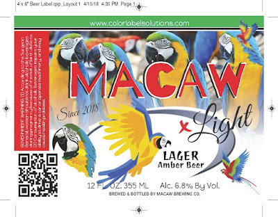
We receive low quality or bad artwork every week to print samples from
prospects. The expression “Garbage In,
Garbage Out” rings true when it comes to label printing.
Recently, I received an excellent document from Afinia that lays out
the differences between Vector and Raster graphics; and when to use each type
in the creation of artwork. Get it here:
Tony
Molina, our Graphic Artist, gave me a simple definition of the two types of
graphics: “Raster are pixels and Vectors
are lines.” Wikipedia says Vector Graphics are defined by 2D points:
Raster
Graphics are defined by a rectangle grid of pixels:
When asked why did Afinia decide to create this collateral piece, Mike
Atkins, National Sales Manager for Afinia Label said, “The issue of art quality
comes up all the time. And we get asked
about artwork creation; this piece gives ideas on how to create better label
artwork. Our goal is to show how Afinia
printers produce high print quality; and it starts with good artwork.”
 |
| Raster Vs Vector Graphics |
Continuing, Mike says, “Vector graphics are great for logos, text and
curves. They create smoother graphics
and are scalable. Raster images are
pictures and are not scalable without looking pixelated.”
During our discussion, I realized that I wanted to be like Mike,
when he said “I hate JPEG files”. I
agree with him that you can’t print JPEG files easily. Mike says, “PDF files are just easier to
print. Anyone can open up in Adobe
Reader if you don’t have to merge variable data. If I receive a PROOF file with other stuff on
it, I can open up in Illustrator and get rid of the die cut lines, etc.
easily.”
In many or most files, you’ll use both
types of graphics.
 |
| Raster AND Vector Graphics |
“In the above image, the background is a
photo (pixel based) and the logo in the foreground is a vector-based design”,
says Mike. Continuing, “the combination
is very common”.
“I create original artwork such as logos
in Illustrator and adjust photos in Photoshop.
In Photoshop, I use a minimum of 300 DPI to make sure photos print OK.
Then, I bring the two type of graphics together in InDesign or Quark
before creating the final artwork as a PDF” says Tony.
 |
| Typical Label Artwork Setup |
Artwork creation makes a big difference in the print quality of the
printers we sell. Remember the
expression: “you can’t make a silk purse out of pig’s ear.”
Contact us if we can support your artwork creation or your label
printing.
Guy Mikel
855-962-7670
info@colorlabelsolutions.com


No comments:
Post a Comment